
After this year’s NCME conference, my P-index now stands at 2 – that is, the number of NCME presidential addresses in which I have been mentioned by name. The cause for the mention in this instance was a continuation of the back-and-forth with Andrew Ho that Damian Betebenner and I started with our 2024 NCME paper, The Time Trap, questioning the utility of the resurgence in the use of time-based metrics such as “years of learning” to describe the post-pandemic state of student achievement.
The reference came in the midst of Andrew’s address calling on the field to commit to improving our communication competencies. Before moving on, I would offer up 325 blog posts and my forthcoming book, Fundamentals and Flaws of Standards-Based Testing, now available to pre-order (shameless plug) as bona fides of my commitment to improve my own and the field’s communication competencies – although every time I read one of Garrison Keillor’s weekly newsletters I feel like a communication neophyte and realize just how much room for improvement I have left.
Further, I feel that relevant to improving communication competencies I must acknowledge that the reason that it was so easy for Damian and me to use Andrew as a foil in our paper is his willingness to put his thoughts and opinions on technical communication issues out there in published papers, presentations, and on various social media platforms. Andrew concedes many of the points in our paper and I heartily endorse virtually all of his, but he is willing to engage in back-and-forth on the others; that type of academic debate is necessary to advance our field and all fields.
In that spirit of academic advancement and camaraderie, let’s take a closer look at the accuracy-engagement tradeoff and the communication tools (i.e., the metrics) that Andew presented, noting here that his use of the simple graphic – two dimensions with a negatively sloped line – is itself an effective and engaging communication tool, one that I first saw used very early in my career during an AERA/NCME presentation by Steve Ferrara, then with the Maryland Department of Education, whose life and work were remembered at this year’s conference.
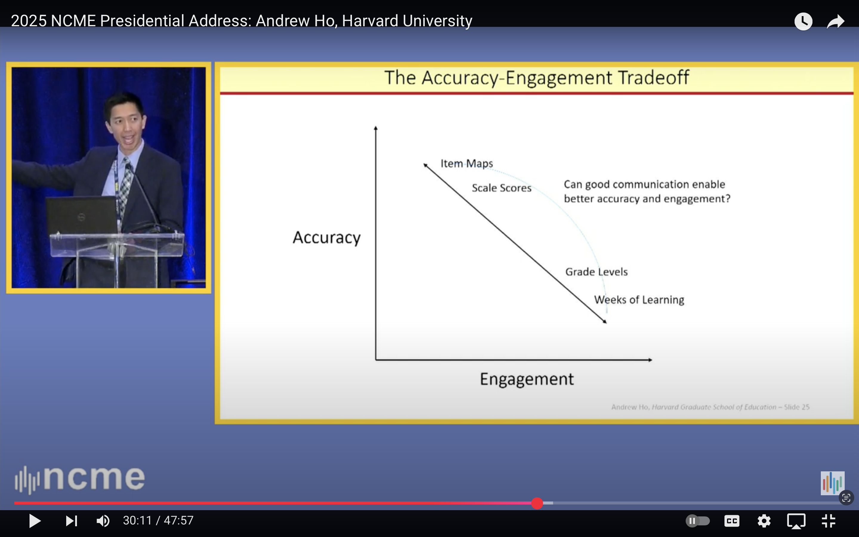
The Accuracy – Engagement Tradeoff
In keeping with proper presentation etiquette and good slide making, Andrew limited himself to four exemplars:
- Item Maps and Scale Scores representing higher accuracy, lower engagement
- Grade Levels and Weeks of Learning representing higher engagement, lower accuracy.
And as suggested on the slide, he asks whether good communication can enable better accuracy and engagement.
There are, of course, other metrics that we need to consider, and we can begin by unpacking two of Andrew’s four choices at opposite ends of the diagonal: Scale Scores and Grade Levels.
Scale Scores
Personally, I use the term scale score almost exclusively to refer to the scores on the underlying theta scales that we generate through our IRT analyses. As a starting point for virtually all of the other reporting metrics, let’s assume, hope, and pray that these scores are accurate. Transformations of these scale scores for reporting purpose, I refer to as scaled scores; and those scaled scores come in various shapes and sizes and are intended to serve various purposes.
- Most reported scaled scores are almost always linear transformations of scale scores intended specifically to be more engaging, and perhaps more informative than the original scale score. One would think that a linear transformation would have little to no impact on accuracy, but one would be wrong. Decisions related to how the linear transformation is made and how the resulting scores are truncated, rounded, etc. for reporting can have a significant negative impact on accuracy.
- Then there are scaled scores that are the result of analyses and transformations to place scale scores from multiple grade-level tests on a single vertical scale. These I would classify as significantly less accurate and perhaps a bit more engaging than scores on our theta scale.
Grade Levels
Andrew’s use of the term Grade Levels is even more tightly packed.
- He might be referring to students’ assigned grade levels, which we know are age- rather than achievement-based with achievement within a single grade level varying by 2, 3, 4, or more “years of learning.”
- He might be referring to classic grade equivalent scores, long a staple in the reporting of norm-referenced test results, in which grade level was determined by the performance of the median student – and Andrew has communicated clearly his feelings about medians.
- Or he might be referring to grade level expectations; that is, the criterion-referenced, standards-based level of achievement expected of students at a particular grade level relative to and defined in terms of the state’s content standards.
Dependent upon which metric one is referencing, we could debate the appropriate placement of Grade Levels on the accuracy-engagement diagonal.
Additional metrics
Of course, there are additional metrics that we could consider as well such as raw scores, NCE, stanines, and the like. Although in a 1986 AERA paper that you can find online while ERIC still exists, Ligon and Bataille of the Austin Independent School District declared “raw scores, normal curve equivalents (NCEs), and standard scores are dysfunctional when trying to explain achievement test scores to most audiences.”
That left them with percentiles or percentile ranks, which arguably do fairly well in terms of both accuracy and engagement, and their favored metric, the aforementioned grade equivalent scores which I would place alongside “weeks of learning” on Andrew’s accuracy-engagement diagonal – an appropriate spot given that they share many of the same flaws and weaknesses.
Not mentioned to this point are statistics such as standard deviations and effect sizes, the unitless intermediaries between scale scores and weeks of learning. Effect sizes were introduced to help put meaning in the mean differences in scale(d) scores; that is, they are a statistic used to interpret a statistic used to describe a score. So, although they are quite popular with a certain set. No. Just no. There are fewer degrees of separation between me and the new pope than between an effect size and something useful to report to most of our intended audiences.
Also not mentioned are scores such as subscores and mastery scores, which have the potential to be both highly accurate and engaging, but unfortunately not when generated from large-scale, standardized tests analyzed with unidimensional IRT models.
So, where does that leave us?
Cluster Fun
When I stare too long at metrics placed on the accuracy – engagement plot, clusters start to form. It seems that what distinguishes “scores” that are accurate from those that are engaging is meaning; that is, something meaningful to the people who will be using the score. The more that we try to add meaning to scores to make them more engaging, the less accurate they become. Ponder that statement for a bit. Whether it reflects a fundamental flaw in our field, in ourselves, or a bit of both is a discussion for another day.
For now, let’s consider how we attempt to add meaning. With the exception of time-based metrics such as weeks of learning, one might argue that we are trying to instill meaning and increase engagement by making a connection to content. That connection may be direct as with standards-based grade-level expectations or more indirect as with grade equivalent scores or grade levels themselves.
Attempts to create behavioral anchors for key scale scores, complete item maps, or simply to report the percentage of students who place the start of World War II in the 1860s are another attempt to bring meaning through content, unfortunately such attempts often fall short and flat for a number of reasons.
So, where does that leave us?
Strategic Choices and The 3 W’s
Andrew calls on the field to make “strategic choices along this zero-sum diagonal”; choices that with the help of “good communication competencies help us bend this line so that we can be both accurate and engaging.”
I would argue that the field made such a strategic choice in the early 1990s and solidified it in 2001 with NCLB. That choice was to place our eggs in the standards-based, grade-level expectations basket. Of course, alternative names for grade level expectations are performance levels, achievement levels, or proficiency levels; and the strategically selected reporting metric of choice was percent proficient.
Personally, I remain a proponent of the use of percent proficient as the primary metric to be reported from state tests. In contrast, if there is a anything that Andrew more strongly opposes than medians, it just might be the use of percent proficient as an accountability metric.
Which bring us to Andrew’s 3-4-5 triangle, specifically the 3 W’s: Who is using Which Scores and for What purpose?
Somewhere in the decade between the shift to a focus on percent proficient in the mid-1990s and NCLB accountability requirements becoming fully operational, the devil got into the details, and we lost sight of who was using percent proficient and for what purpose.
As a school accountability statistic, percent proficient is deeply flawed as Andrew has argued and as Rich Hill and I demonstrated. Many of the statistical, measurement, and interpretation flaws associated with its use, however, can be ameliorated or somewhat offset with strong communication competencies and if the following conditions are met:
- The goal is 100% proficient – no child left behind.
- There is a hard deadline to achieve that goal.
- The focus is on progress toward the goal over time (e.g., 3-years, 5 years) and not on year-to-year fluctuations in annual scores.
- The focus is longitudinal and not cross-sectional, particularly if the pipeline guarantees different starting points.
- We don’t use labels such as “failing school” to describe schools that don’t meet a particular accountability target or “effective school” for those who meet the target.
- We treat “percent proficient’ based on the state test as one layer of accountability (perhaps the top layer) in a multi-tiered school evaluation and improvement system. Additional metrics and indicators are introduced in other tiers.
- We provide adequate supports for students and schools to attain the goal.
When one, two, or all of those conditions are not met (as was the case with NCLB and ESSA), the use of percent proficient as an accountability metric becomes a fool’s errand.
The appropriate use of percent proficient, however, is perhaps our easiest problem to solve.
As we move forward, different types of tests will be introduced to support different types of scores and different types of decisions, for example, decisions about mastery of high-level standards or attainment of complex competencies. It is inevitable that over time (or even during the design phase) assumptions, conditions, and intended used of test scores will change.
We must continue to ask who is using which scores for what purpose and we must make a commitment to communicate? And we must continue to be willing to hold ourselves and others to the highest standards.
Header image by Gerd Altmann from Pixabay

You must be logged in to post a comment.